THE PROBLEM
It has been largely forgotten that table tennis began in England at the end of the Victorian era, as competitors currently lean towards an American style to appeal to audiences.
THE OBJECTIVE
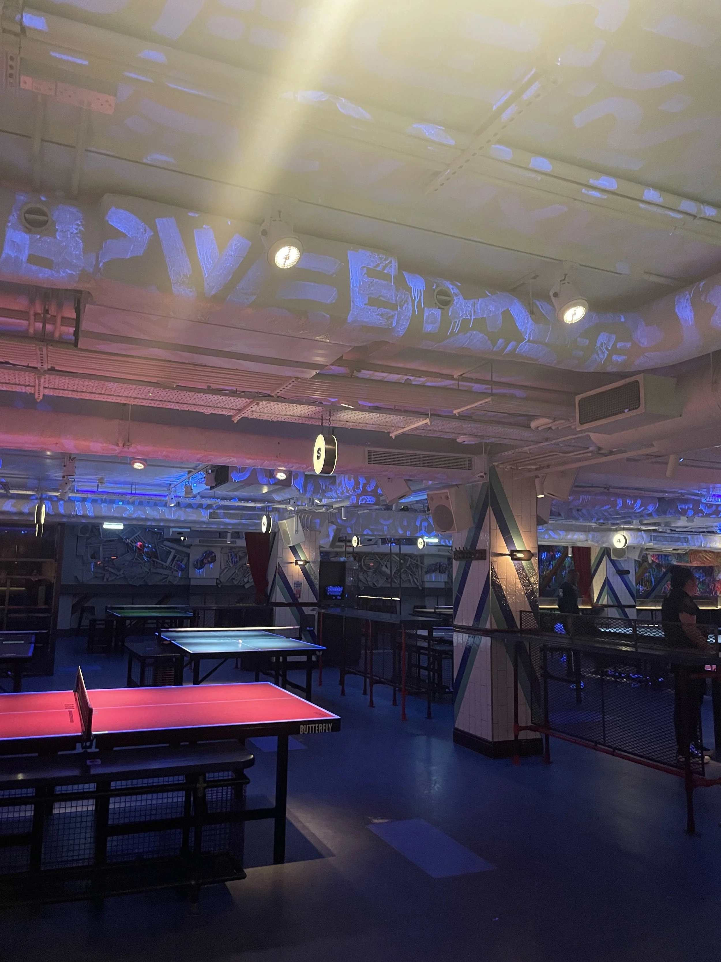
To provide a space that celebrates the English heritage of table tennis by providing room to play and connect with others in a classic pub space.
THE WORK
+ Branding
+ Copywriting
+ UX & UI
+ Experience
+ Advertising
BRANDING
Pip’s Ping Pong Pub
A pub dedicated to the creation of table tennis in England in the 19th century.


THE THINKING
During my time in London, I was thinking about English sports and was surrounded by royal iconography every day. I had the opportunity to visit Wimbledon and discovered that Ping Pong was originally inspired by lawn tennis in England.
THE PROCESS
Leaning into the royal origins of the sport in the 19th century, I found that the first stamp also featured Queen Victoria. I developed the logo and branding around this idea, while using patterning from the older period balanced with the bold visuals and copywriting of today.


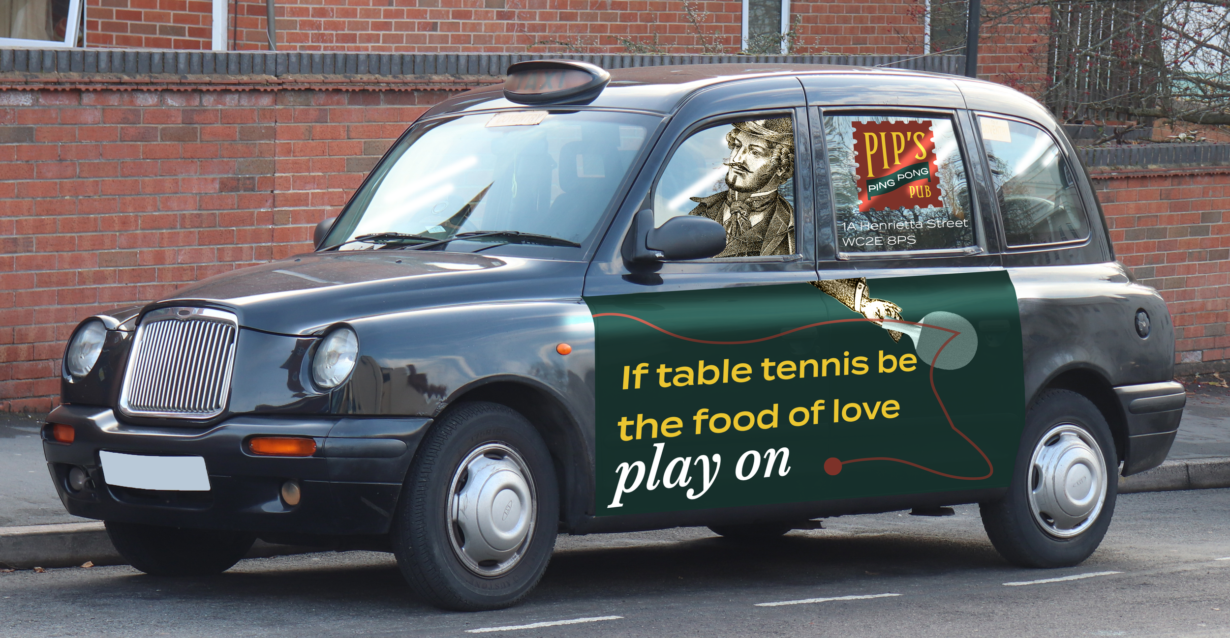
Highlighting Pip’s English heritage using well-known Shakespearean quotes intertwined with language derived from ping pong.
THE AD STRATEGY


THE EXPLORATION
Creating a solution comes from many sketches, iterations, prototypes, and best of all, mistakes. With constant feedback and analyzation at each step of the work, the process yields great results. Here’s a peek at some of the steps I flew between while working on Pip’s.
-
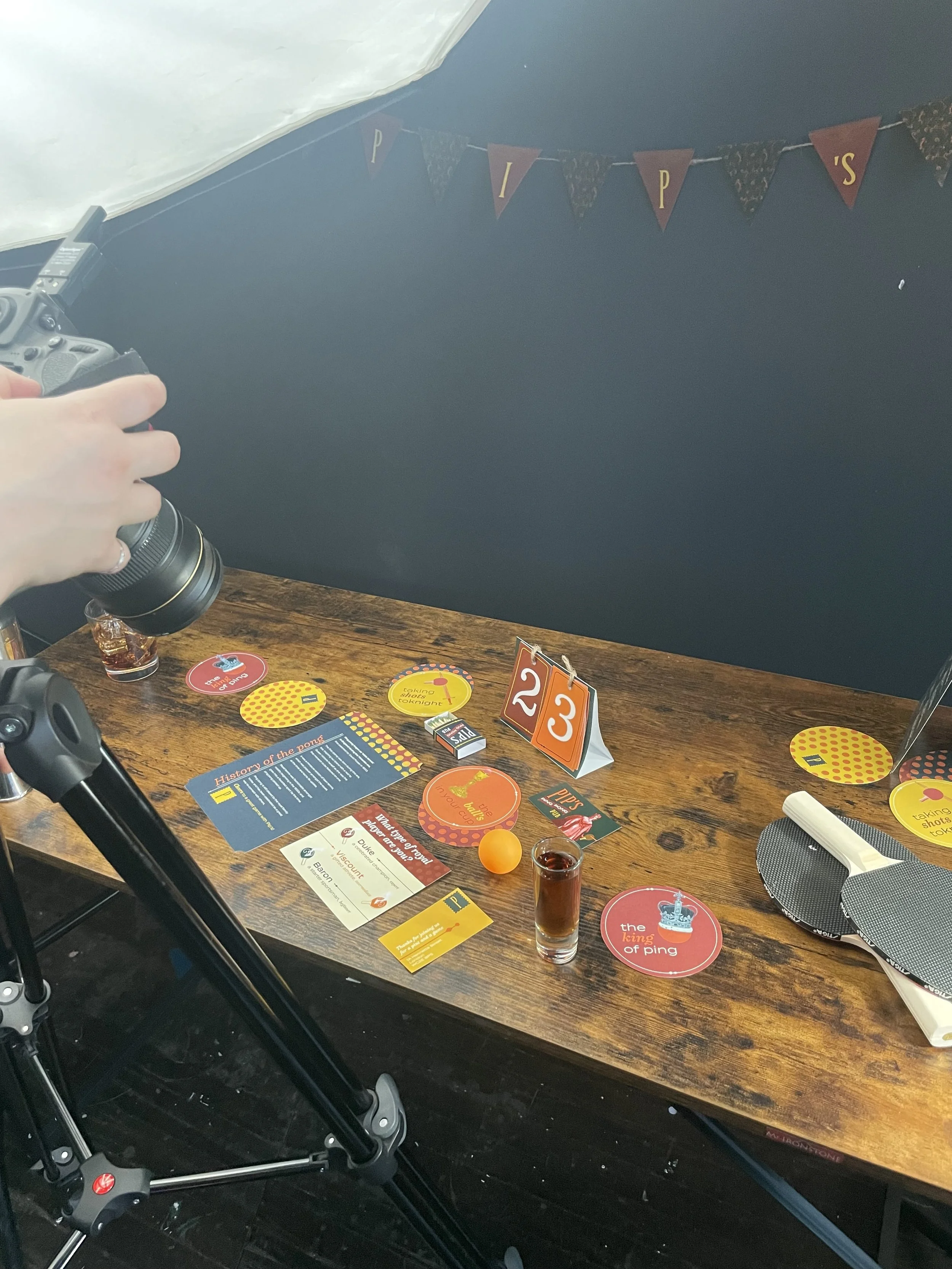
![]()
Art directed shoot
-
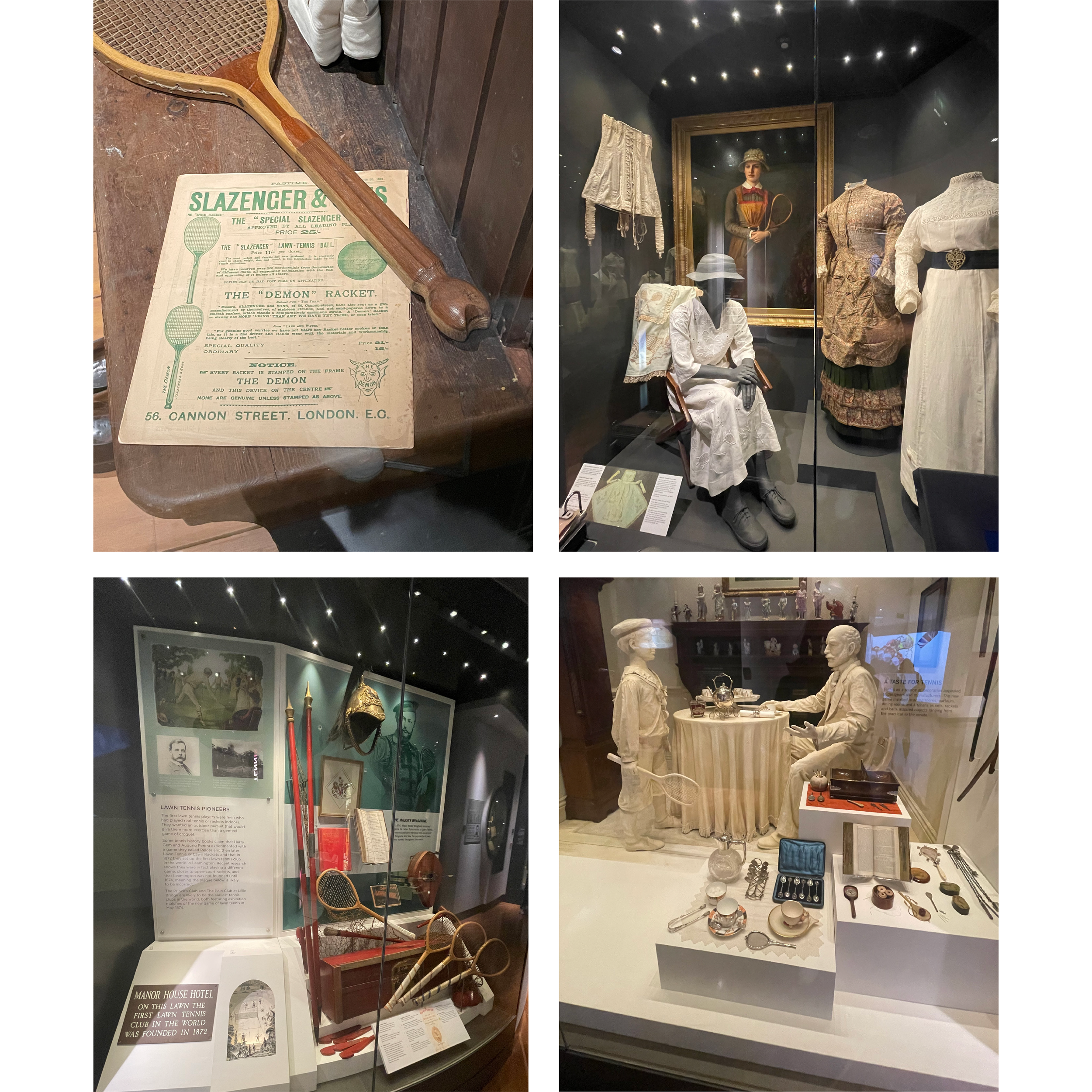
![]()
Wimbledon exploration
-
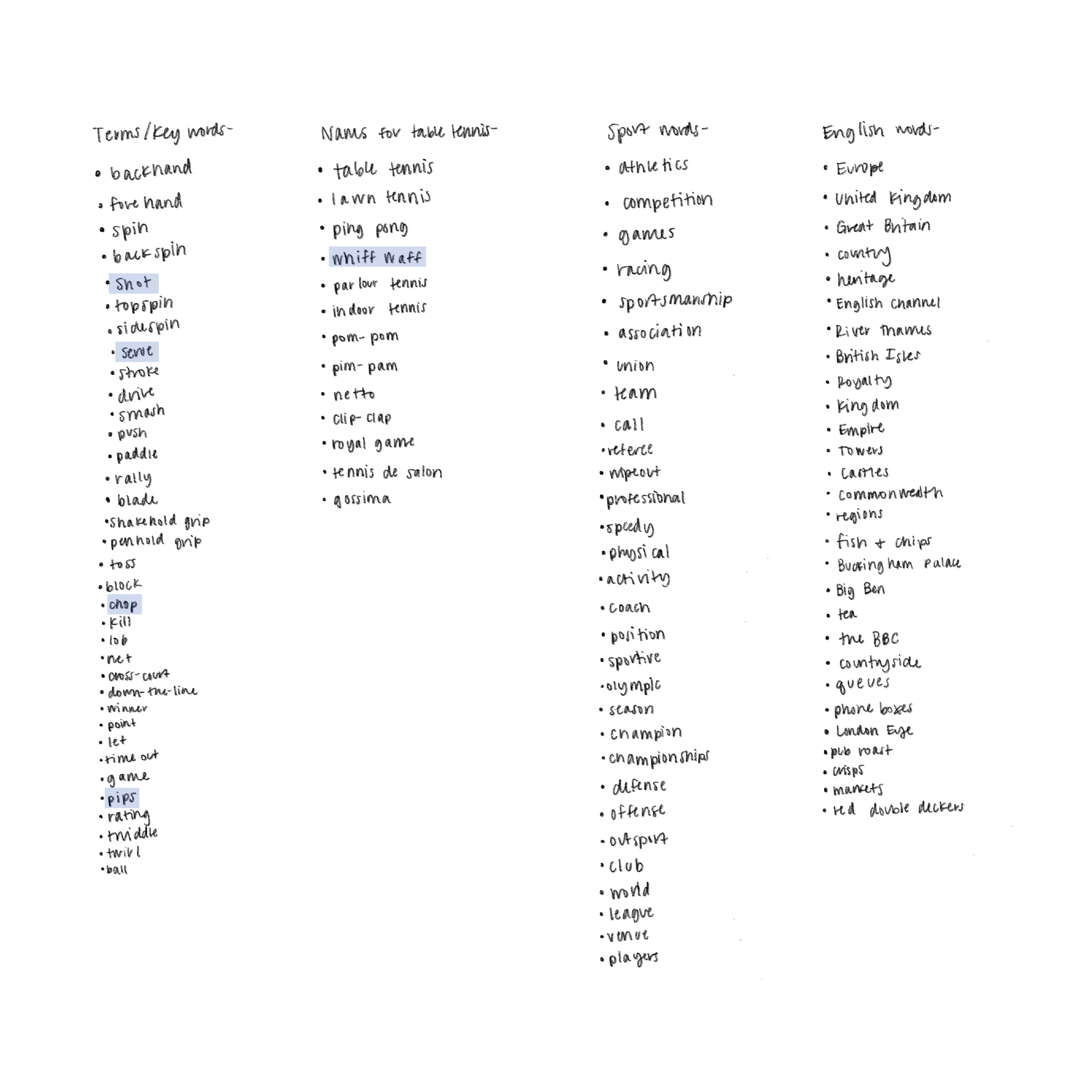
![]()
Naming ideation
-
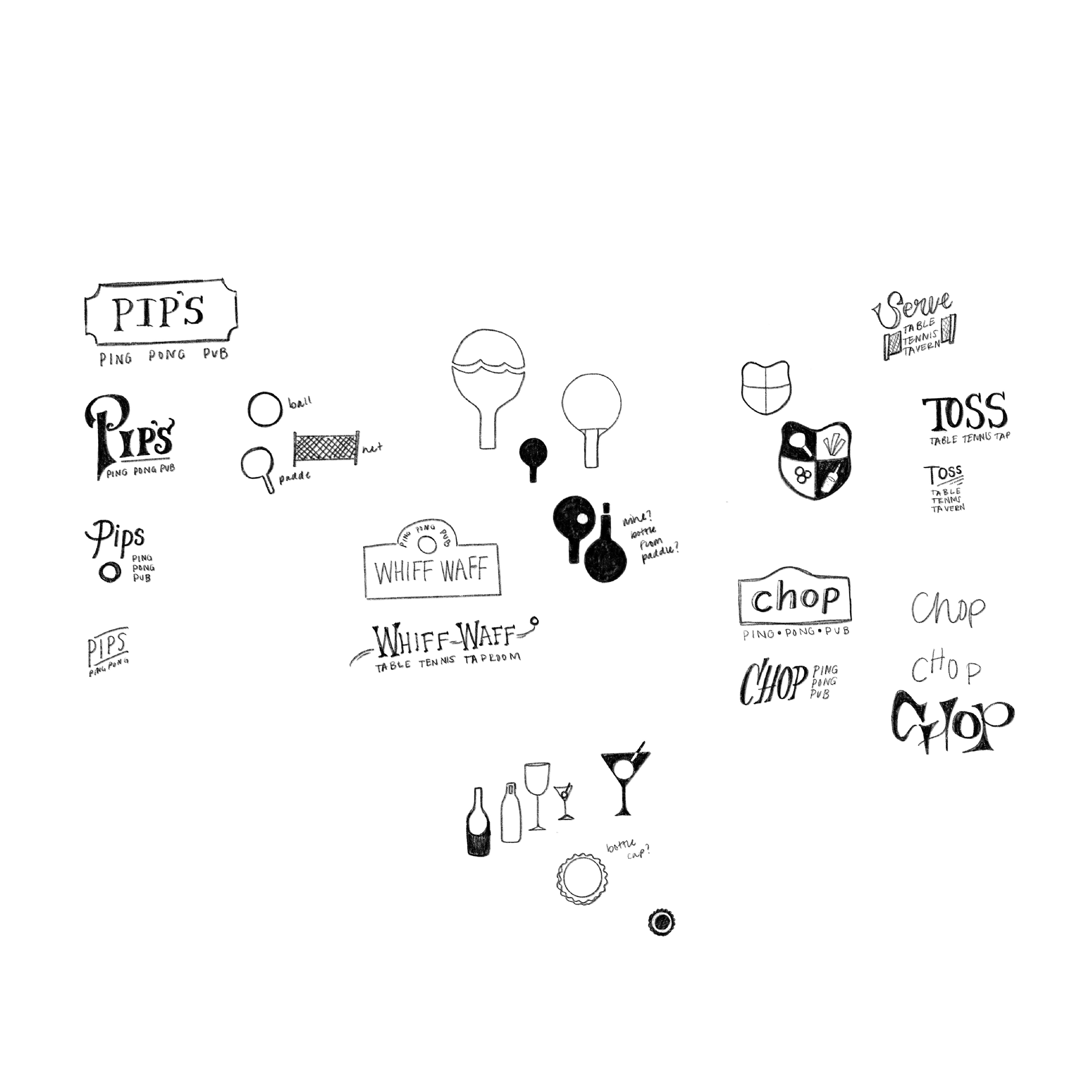
![]()
Logo sketches
-
![]()
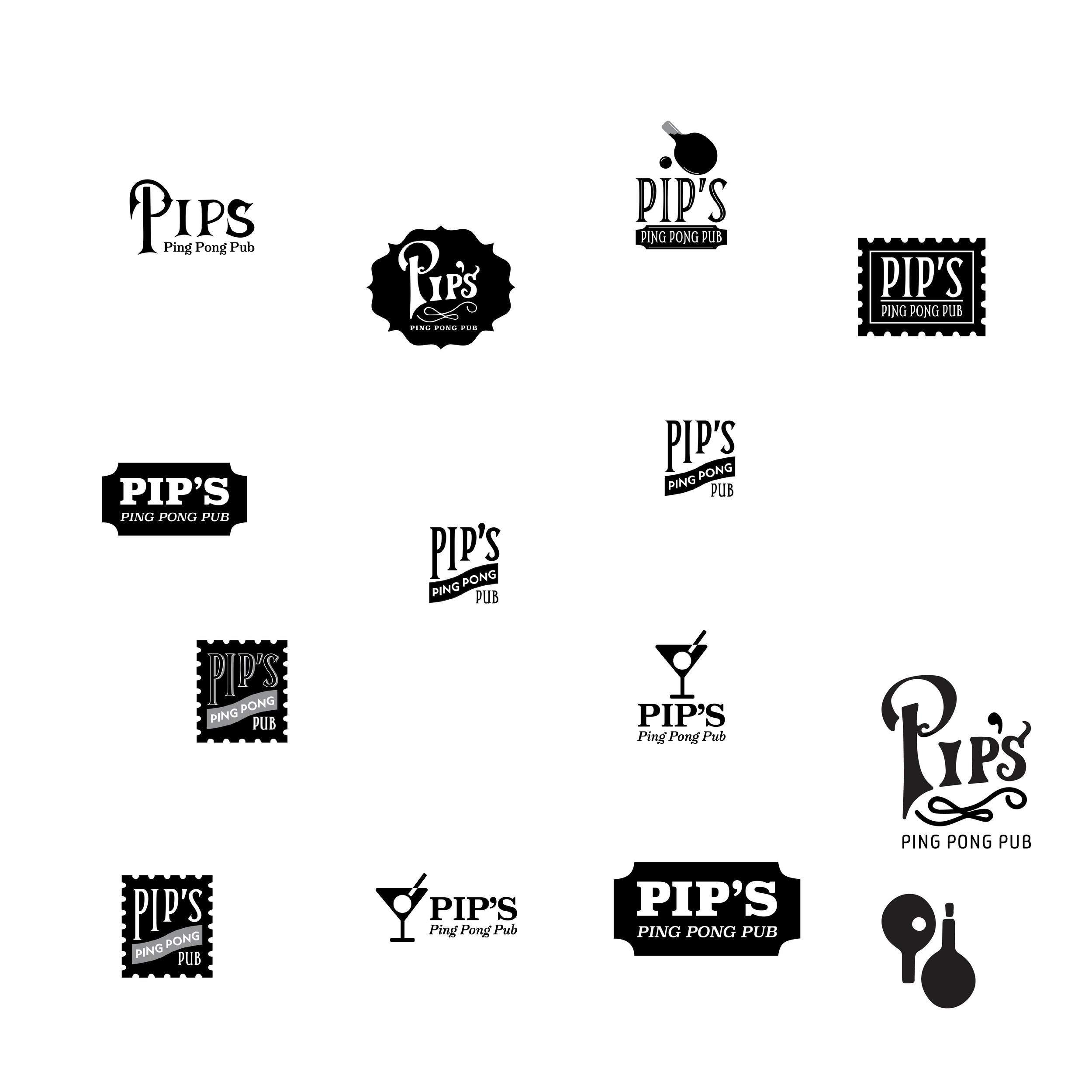
Logo iteration
-
![]()
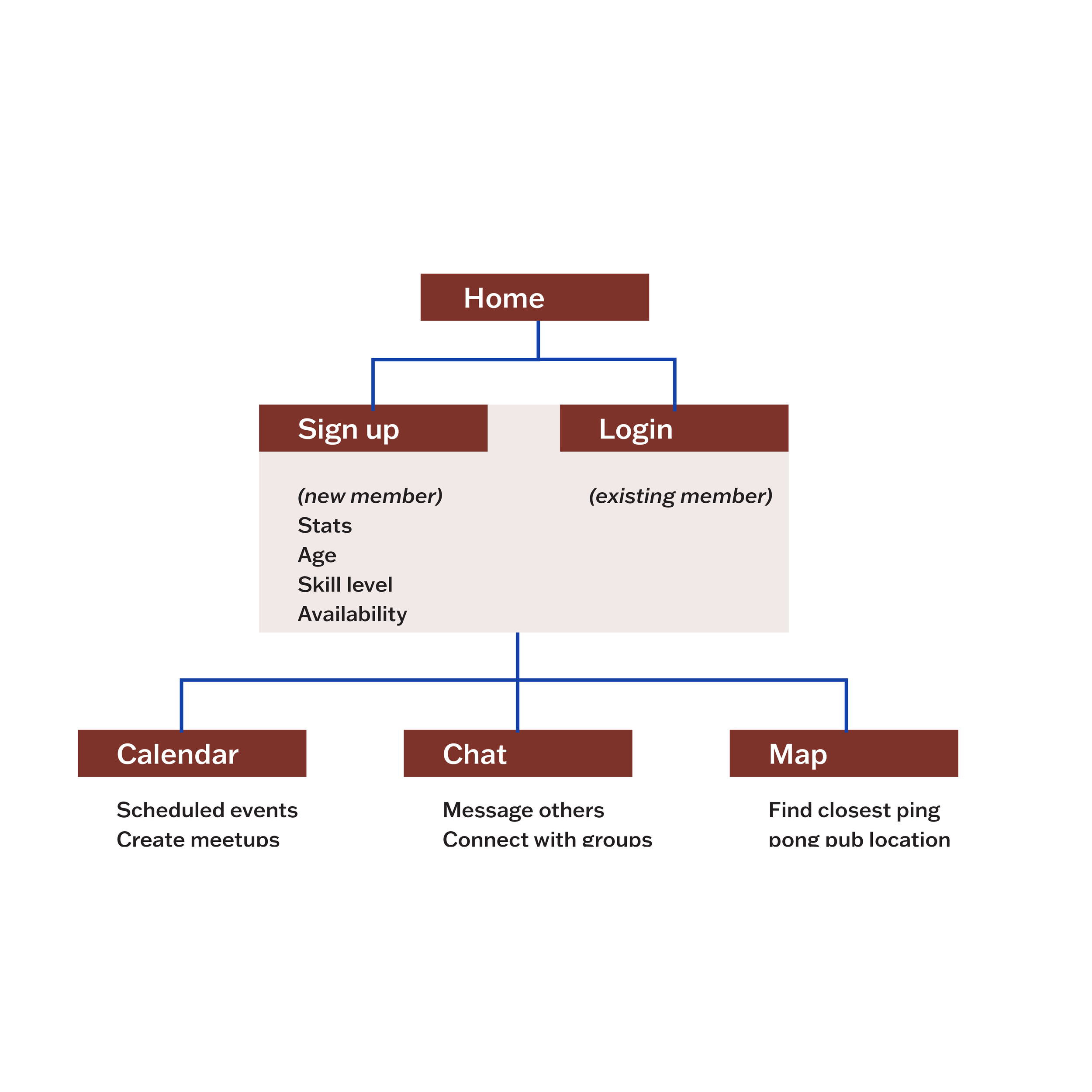
App sitemap
-
![]()
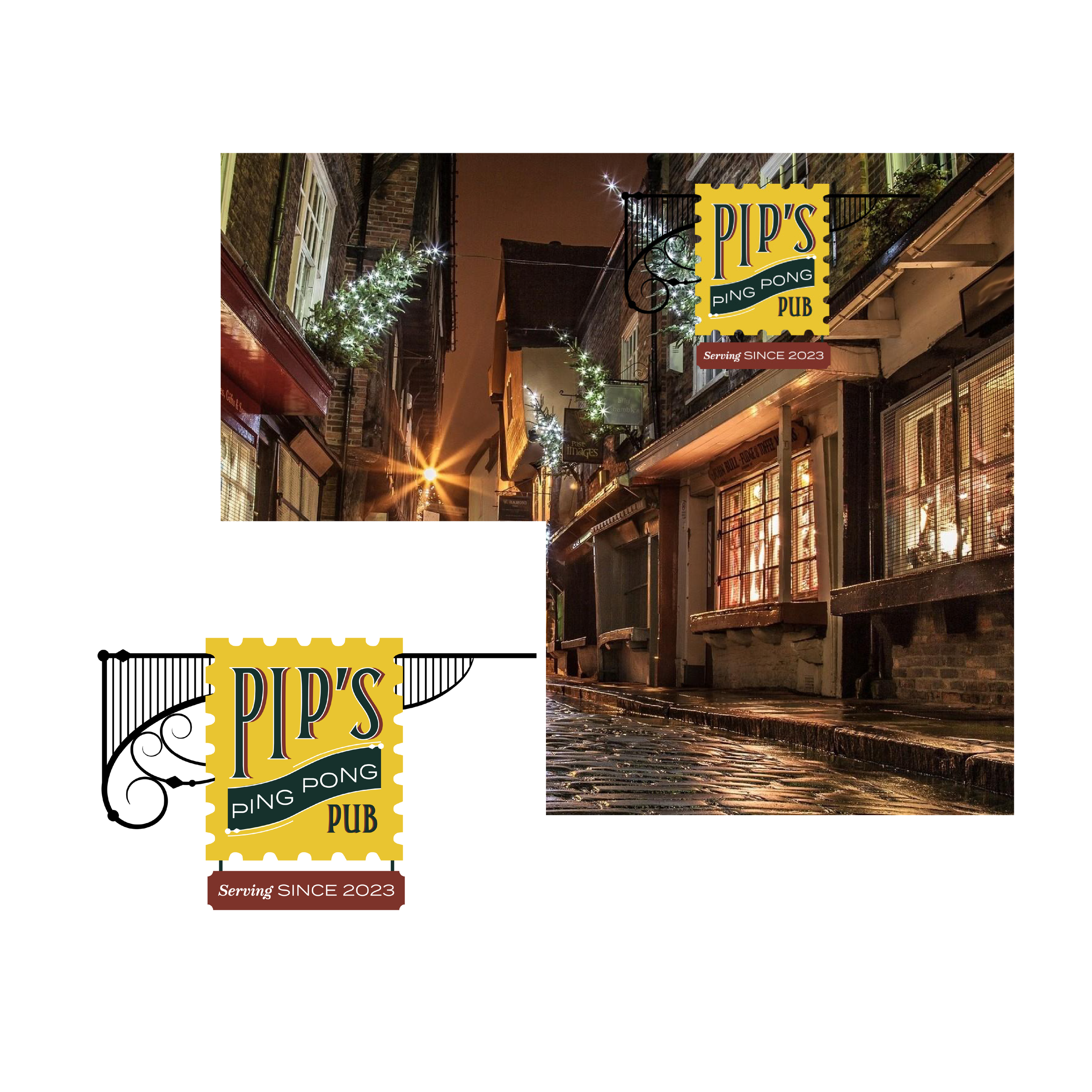
Signage ideation
-
![]()
Pattern design
-
![]()
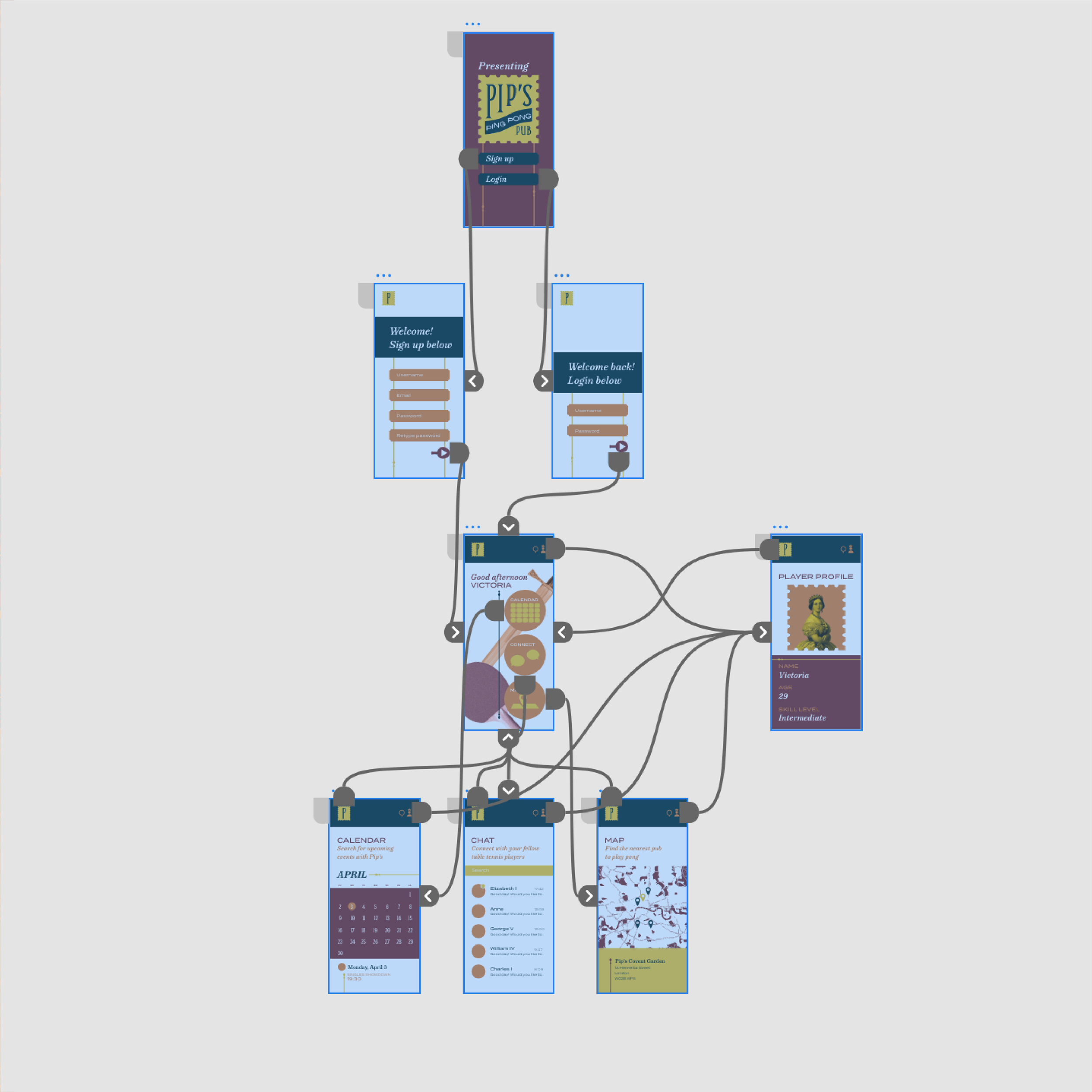
App wireframing
-
![]()
Competitor research