

UX & UI
The National Ski Patrol,
Safety App
Connecting people to Ski Patrol whether they have a severe emergency or just need a little help on the mountain.
THE PROBLEM
911 emergency services are being utilized to connect skiers to ski patrol during non-life-threatening emergencies. Different resorts use different phone numbers for ski patrol, making accessibility difficult for those who don’t know the specific number to call.
THE OBJECTIVE
To connect people that need help with ski patrol and allow them to rate their level of emergency, then provide care based on their level of need.
THE WORK
+ Branding
+ Logo system
+ Art direction
+ UX & UI
+ Experience
+ Advertising
+ Copywriting


APPLE WATCH
The National Ski Patrol Safety App allows users to connect their Apple Watch. This creates a more seamless response method, as users don’t have to pull out their phone while on the mountain if they aren’t able to.
The Apple Watch app also tracks users vitals and movement, and will send an alert if no movement is detected after 5 minutes. If there is not response, patrol will be sent to check in.

ONBOARDING
When signing up for The National Ski Patrol Safety App, users are prompted to input information pertaining to their skiing preferences and medical history.
This is part of crafting a customized response if someone needs emergency care later in their skiing experience.
PATROL DESKTOP END
Considering the user flow of the emergency responders, the desktop version gets alerts from The National Ski Patrol app.

THE THINKING
The people who get stuck out on the mountain and aren’t sure what to do, but also thinking about the emergency situations I’ve been in when I’ve needed direct access to ski patrol. When skiing at a new resort, it’s not very common to look up the local ski patrol’s phone number until you need it.
THE PROCESS
Looking at the existing brand guidelines for The National Ski Patrol and learning about the organization, I worked on developing a cleaner brand guide for use in the app. The app was designed considering the experience on the mountain, and what would be the easiest way to access care in an emergency or non-emergency situation.

THE BRAND
Recognizing that The National Ski Patrol has a legacy and rich history, this rebrand focuses on using the nostalgic Swiss design of the original while modernizing the look and feel.

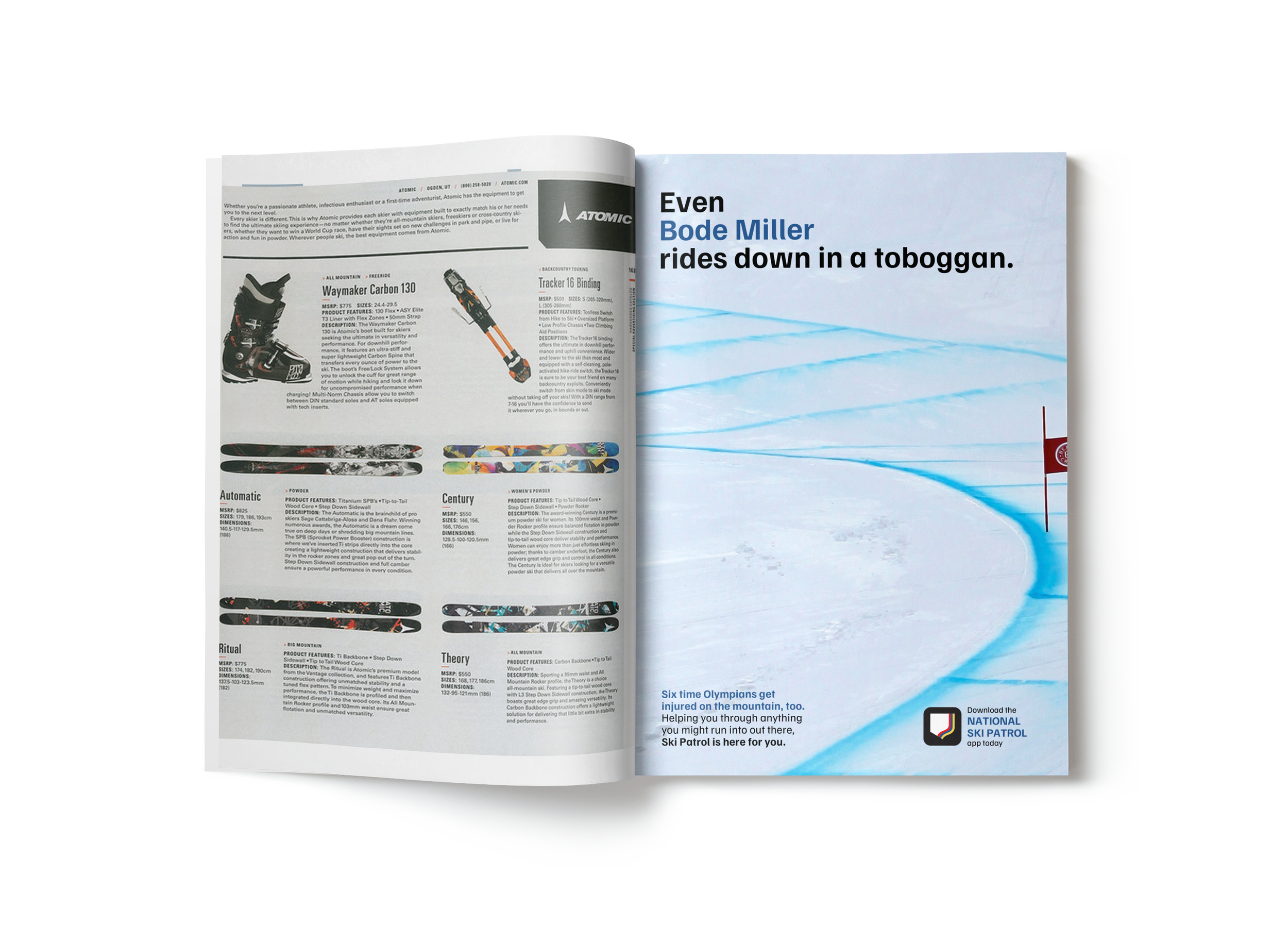
THE AD STRATEGY
Showing that even Olympians need a little help sometimes and require ski patrol, making other skiers and snowboarders feel understood and pointing to the app’s importance.


THE EXPLORATION
Creating a solution comes from many sketches, iterations, prototypes, and best of all, mistakes. With constant feedback and analyzation at each step of the work, the process yields great results. Here’s a peek at some of the steps I flew between while working on The National Ski Patrol.
-
![]()
Art directed shoot
-
![]()
Research
-
![]()
In person rsearch
-
![]()
Mindmaps
-
![]()
Sitemap planning
-
![]()
Logo sketches
-
![]()
Sitemap development
-
![]()
App wireframing
-
![]()
App onboarding wireframes
-
![]()
Product ideation


